Emporium Rebranding
Emporium Melbourne describes itself as a world-class retail environment that fuses fashion, culture, food and art. They want to be known as a luxury retailer that provides a unique experience for their customer, and that reflects the changing season of retail fashion.
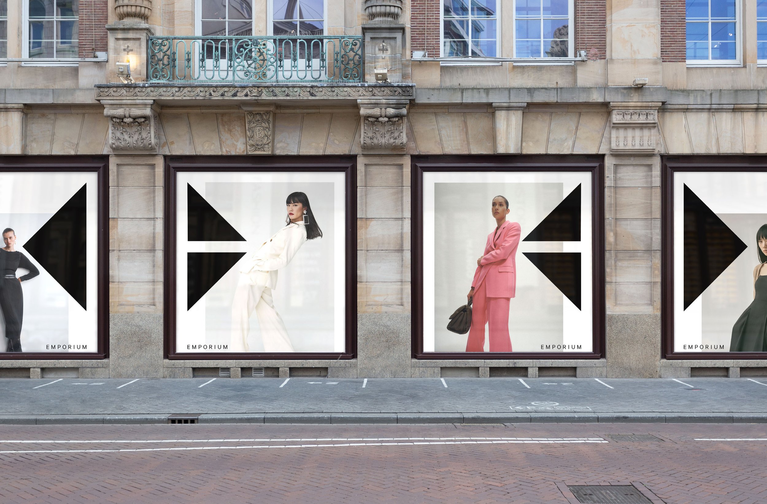
The goal for this brand refresh is to give the Emporium an updated look and feel, and something that reflects the high-end/luxury nature of the place.
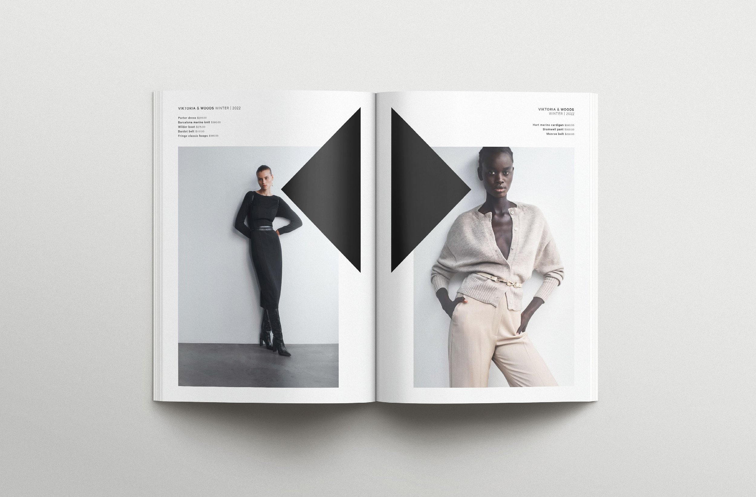
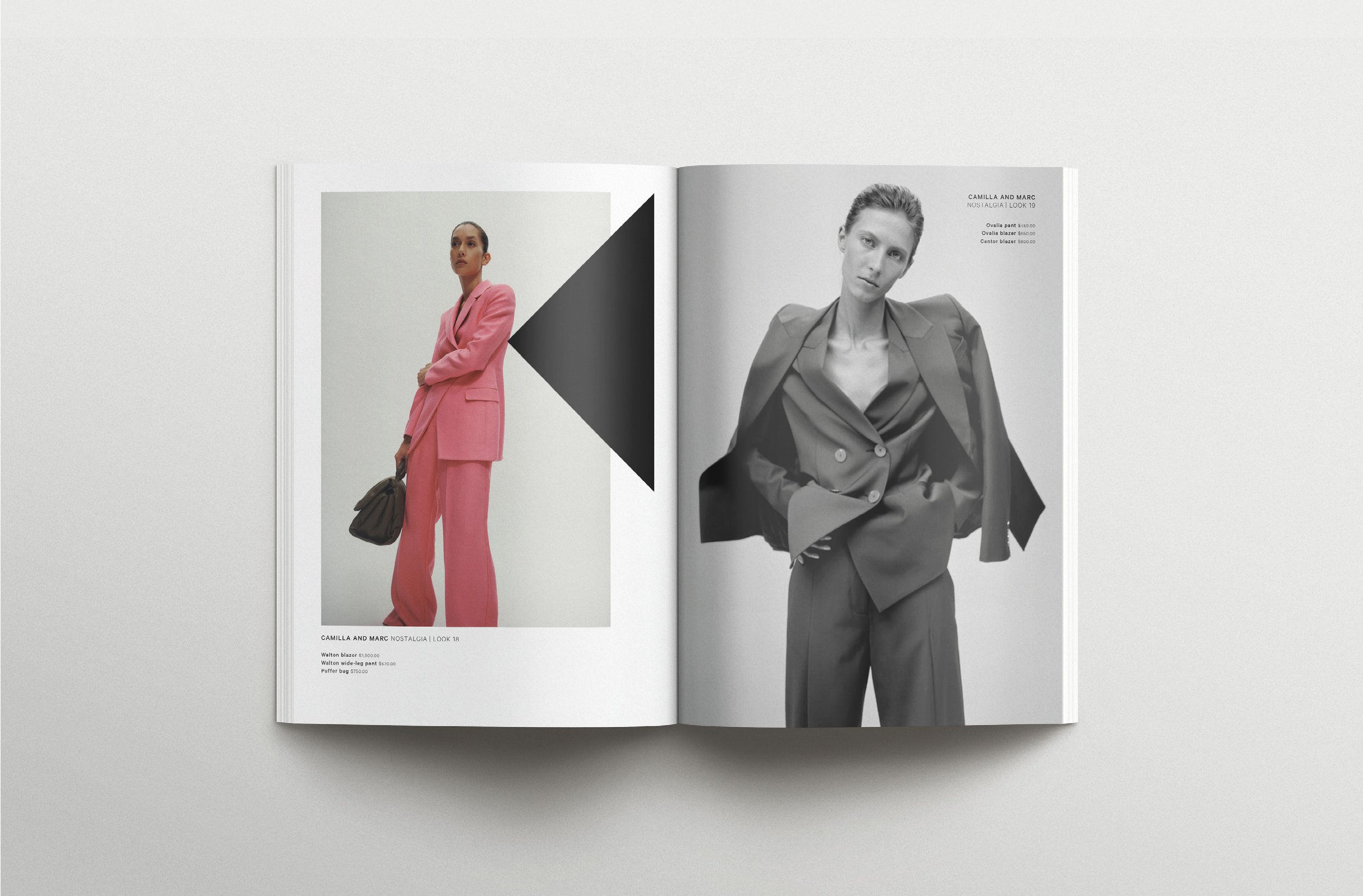
I intend for the brand elements to be applied to a variety of media. This includes billboards or posters within the shopping precinct itself, as well as billboards on streets, such as near bus or tram stops. The elements may also be applied to gift vouchers, business cards, lookbooks, and other print elements. In terms of digital applications, the elements can be used on social media, such as Instagram and Facebook, or even on their website.
I have developed a lot of my design around the architecture of the Emporium. They use a variety of shapes, including triangles, rectangles, squares, and trapeziums. My process involved collecting a range of inspiration images of the Emporium architecture. This was then followed by tracing certain shapes that were visible and then arranging them into patterns.