Serifbabe Type Specimen
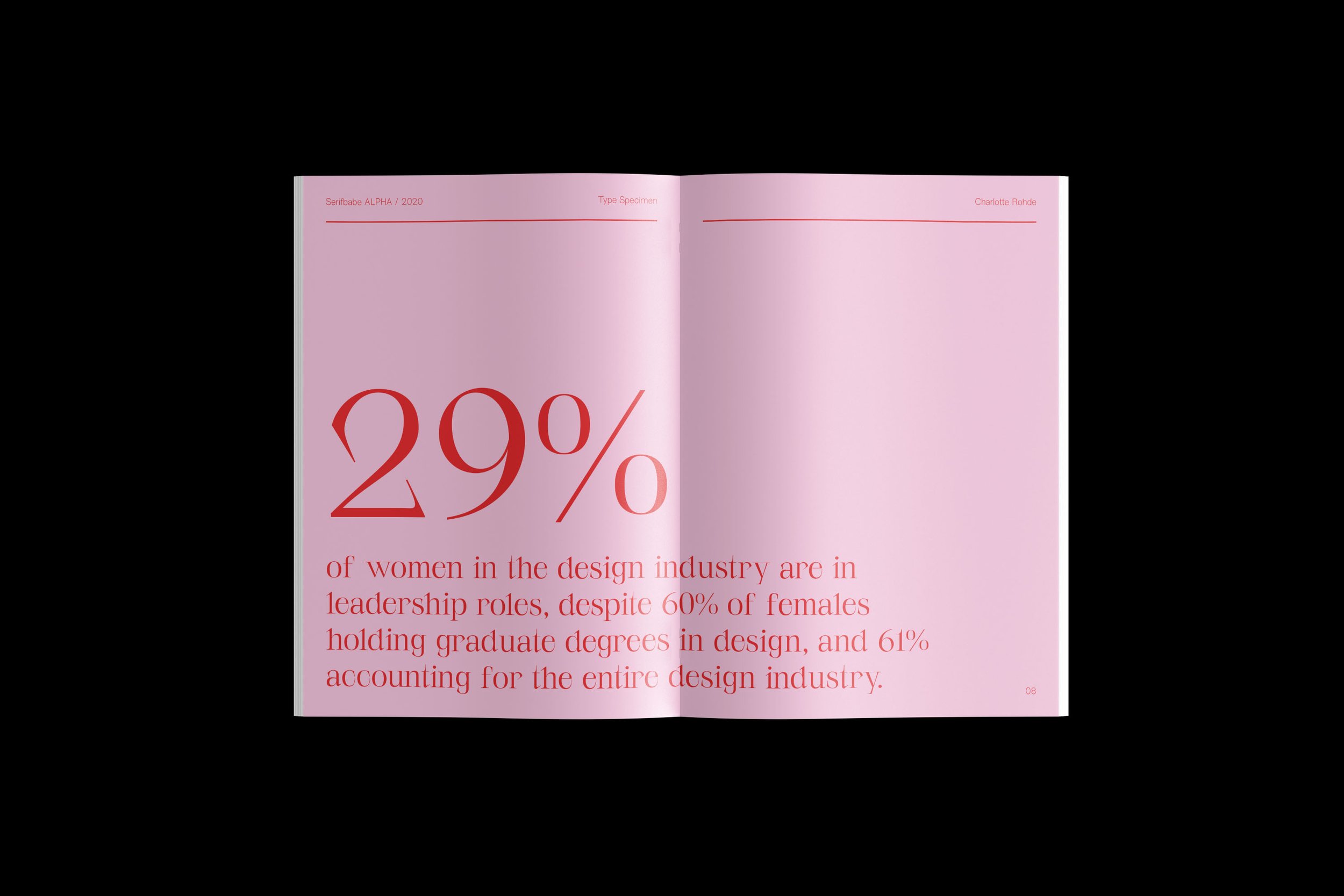
Charlotte Rohde encompasses feminist discourse in her designs, and likes to challenge the lack of female representation that exists in the design industry. She places importance on using type as an extension of her voice, using it as an emotional tool, perhaps creating statements she couldn’t do herself.
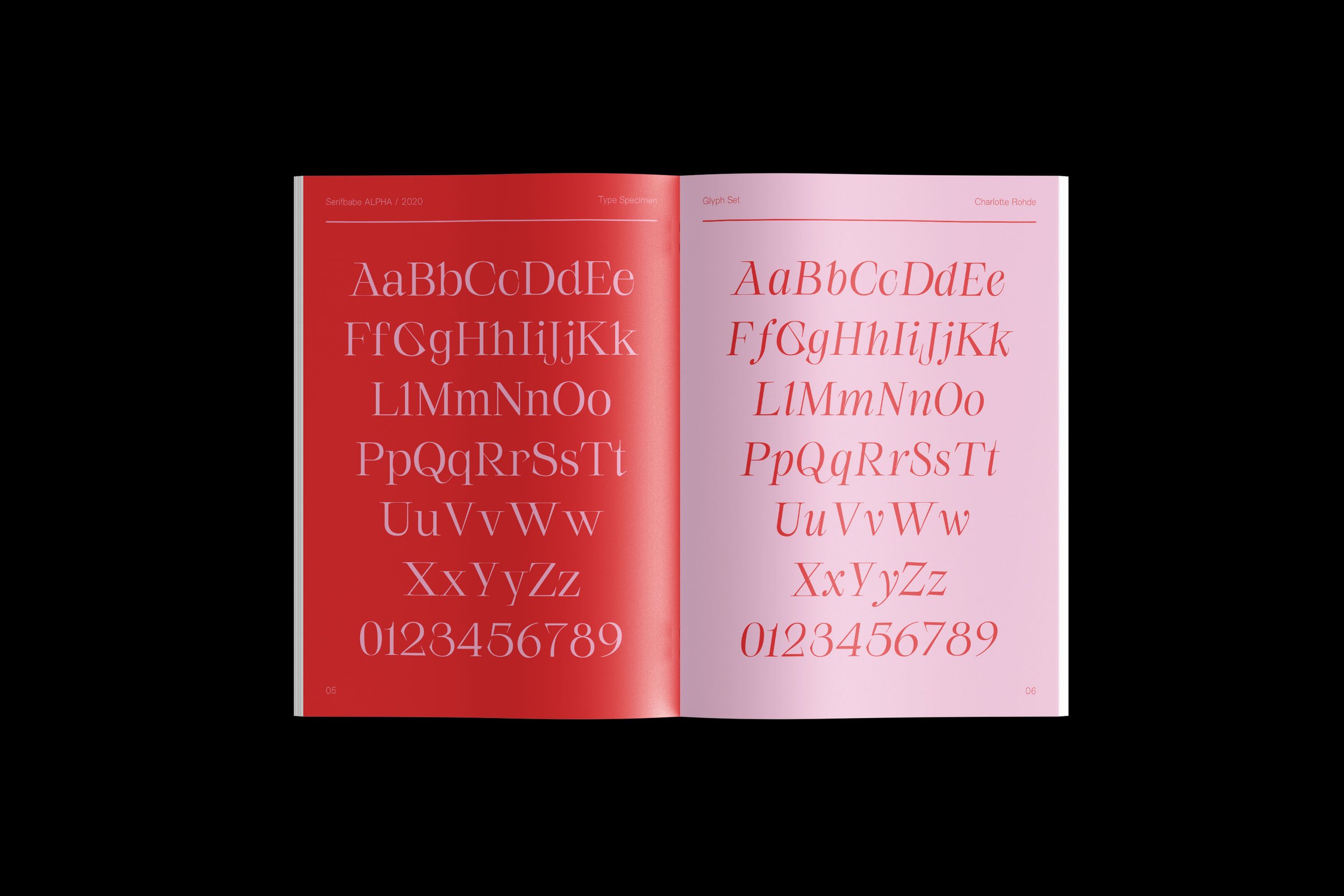
Taking this into consideration, I wanted to use pink as a way to clearly show the aim of this typeface design, as it is a colour often associated with feminity. However, I have contrasted it against the bright red. I chose red, as I believe it is a colour that represents fierceness, power, and confidence. This is exactly what Rohde was trying to represent with Serifbabe. She describes Serifbabe as being anything but neutral, it is unique, beautiful, eccentric, powerful, sensual, elegant and unruly, with hints of exaggeration and expression. I also wanted to celebrate the contemporary nature of the typeface, creating a colourful, yet informative specimen. I used large type to display key defining features of the typeface, wrote quotes from Rohde herself, as well as used it for title pages and decorative elements. However, to convey important technical information, I paired it with another one of Rohde’s typeface designs, named NewEdge 6666. This creates a slight contrast against the serif typeface. I felt that it was important to use another typeface created by Rohde, if not by a female designer, as we can often be looked upon in the design industry.