Wayfinding: Potter Museum of Art
The task was to create a successful wayfinding system for the Potter Museum of Art. The redevelopment of the Potter Museum focuses on public, open and pedagogical aspects. The new wayfinding system combines the unique conditions of its location near school with the addition of educational and leisure facilities, developing its interdisciplinary and intercultural educational and functional value based on the museum’s original identity.
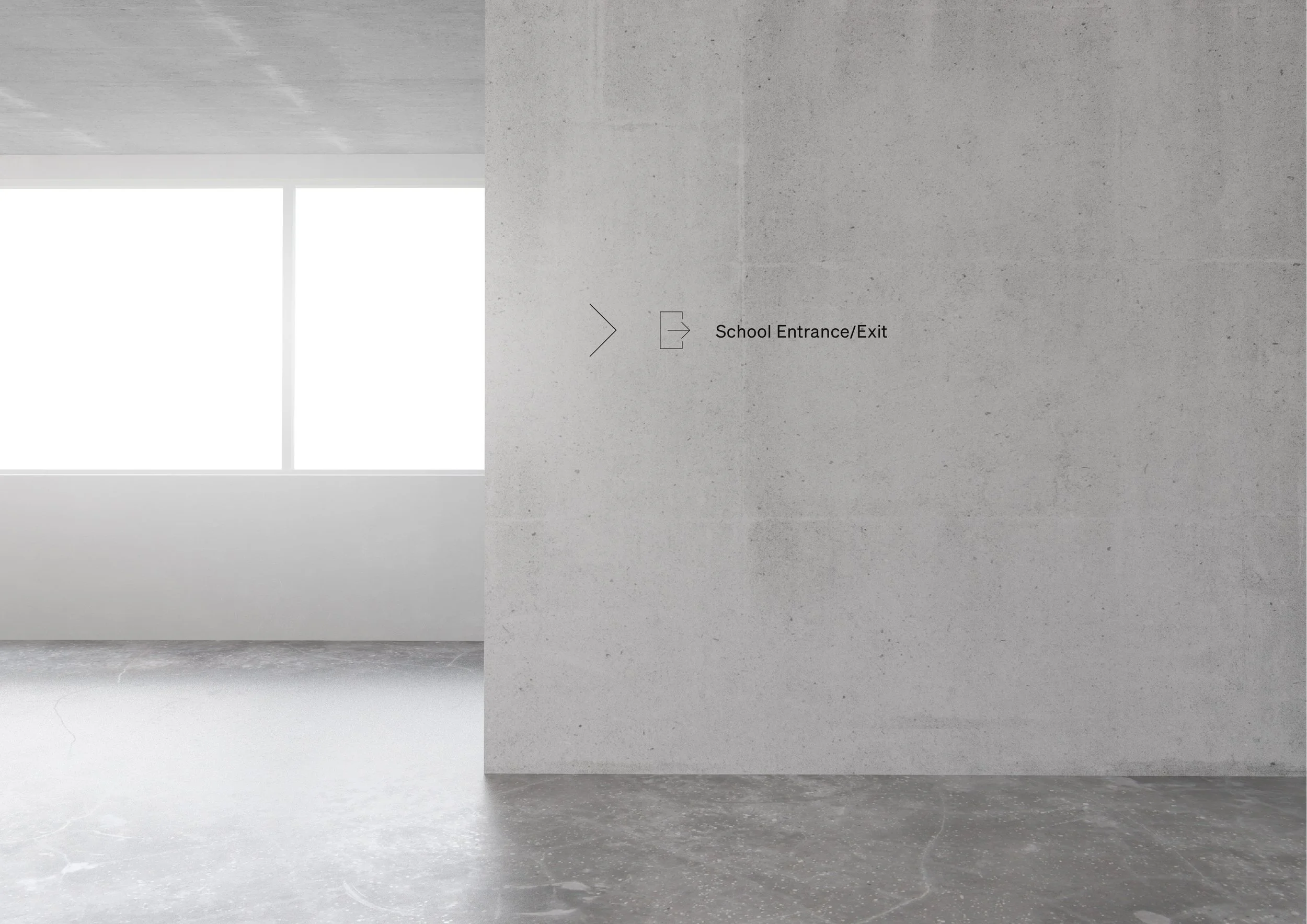
The use of neutral colours and chrome effect helps to provide a clear and directional visual experience for visitors. Additionally, the use of pictograms and wayfinding text on the internal walls and external signage helps to achieve a clear and legible direction for visitors. By refraining from the use of colour, it allows for the wayfinding system to be as accessible as possible for potentially colourblind or visually impaired visitors.
These decisions take into account the museum’s size, functionality and the cultural characteristics of its exhibits, as well as user experience and interaction considerations integral to making the museum attractive and accessible for visitors who may be disabled, visually impaired and/or hard of hearing.