Moderna Museet Rebranding
Moderna Museet has the world’s finest collection of art from Sweden and internationally, and it has a unique breadth and depth. Their collection involves paintings, sculptures, installations, films, videos, drawings and prints from the 20th–21st centuries. They are known as an open and dynamic museum, where they constantly rewrite the standards of modernism, and they often change their collection in innovative ways.
Moderna Museet caters for a range of audiences as they strive to be inclusive and celebrate diversity. Although particularly, visitors may involve individuals who are forward thinking, have a love for art, or are just interested in learning about the culture and local history around them.
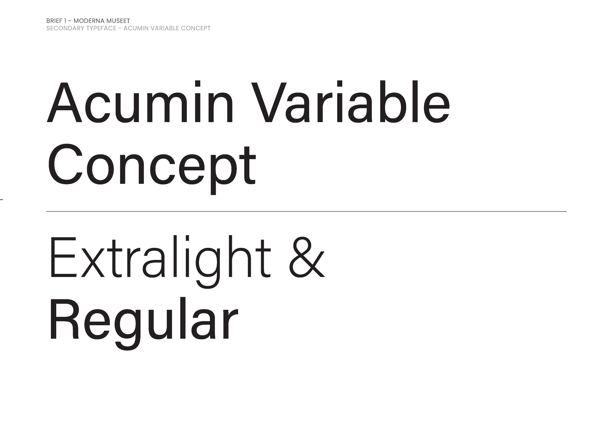
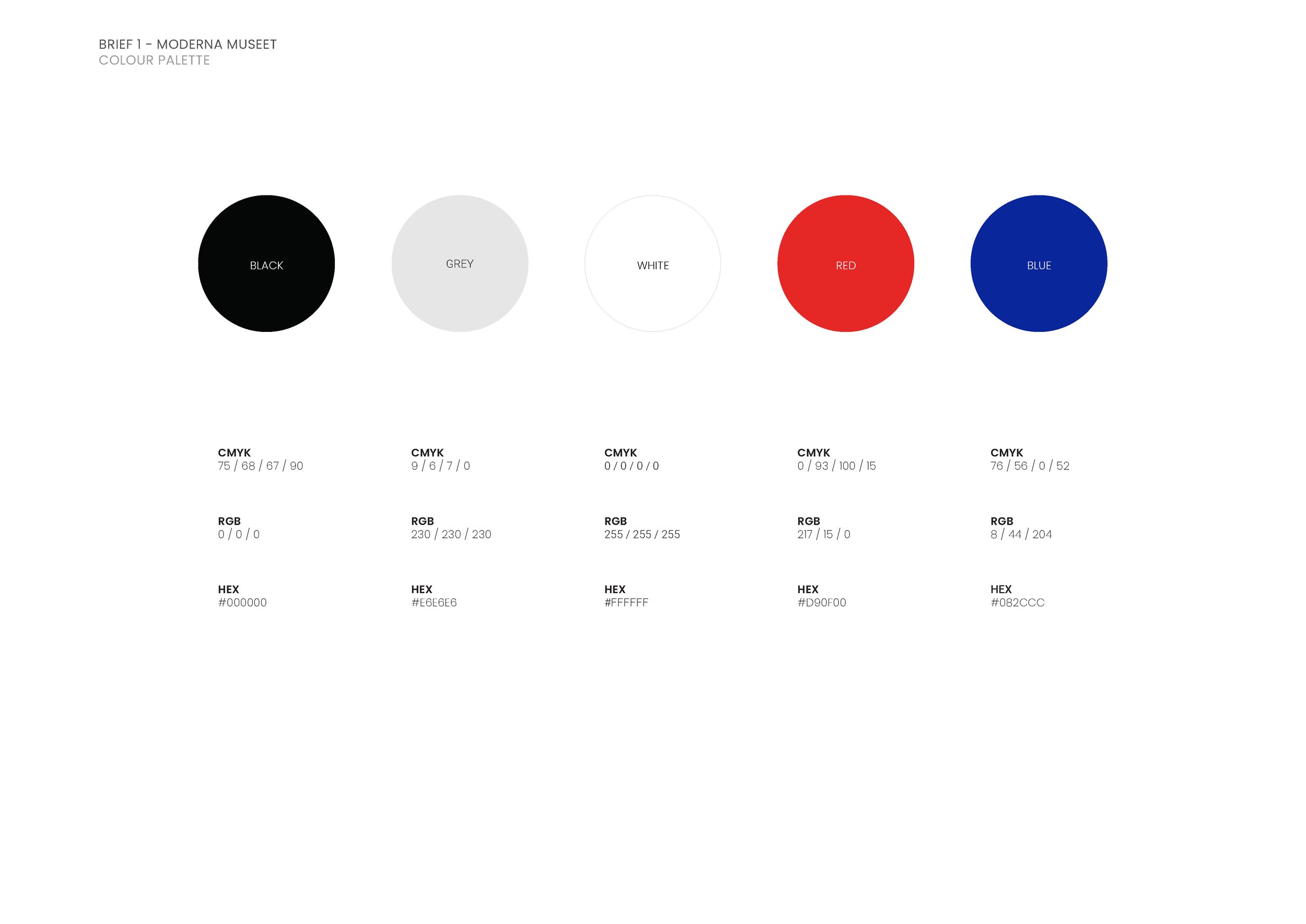
They describe themselves as an inclusive space and celebrate art broadly. They want to be a vibrant, open and dynamic museum. They also describe themselves as a “museum for the future.” In saying this, I wanted to use sharp edges presented in a sans serif font, the use of framing in the logo, and the composition of image and text. This is quite different from Rauschenberg’s loose, handwritten logo, into something more structured. I was inspired by the red/orange colour of the architecture of Moderna Museet in the Malmo location. I decided upon the hero colours being red, black and white, complemented by touches of blue, creating the vibrancy that the museum wish to achieve. These colours are applied to the logos and typography, which are used for a variety of contexts, including posters, banners, brochures, animations, merchandise, and stationery. I have also selected artworks from the museum based on this colour palette to incorporate into the brand refresh. These are able to interchange as the museum changes their collection.